The message behind scientific figures
March 10, 2020
Scientific figures are “the graphical interface between people and data” (Rougier et al 2014). They come in many forms and can be perceived differently based on whether the same data is plotted using a line plot, histogram, or pie chart. As with writing, scientific figures must clearly communicate a message to the audience. When first looking at data with colleagues, it is fine to make quick graphs with excess data to begin pulling out trends and results. However, once a graph is distributed to the public, it should communicate what you and your colleagues found, without misleading the audience. Misinterpretation of data can become a huge problem, which is why scientists need to learn how best to communicate data through figures.
What if the public misinterprets data on public safety?
During times of worry or fear, such as with the recent spread of coronavirus (COVID-19), news outlets and the public can use scientific figures to learn more about the issues. If the graphs are too complex, people are bound to perceive the data differently than what is intended, and this could lead to the spread of misinformation. Figures 1 and 2 demonstrate two graphs on the same topic: the transmissibility of COVID-19 compared to other diseases. In the figure 1 publication, Lui et al (2020) explain that if the reproduction number (R0) of a disease is above 1, it means the number of infected individuals is likely to increase. Even with the graph legend: “Timeline of the R0 estimates for the 2019-nCoV virus in China”, minimal information can be gathered from the graph. It takes reading the publication to understand that each dot represents the date of publication (x-axis) vs transmissibility estimate (y-axis) from eligible studies. In addition, the R0 values on their own do not tell the public about whether these are particularly high transmission rates and what to expect/prepare for in the future.
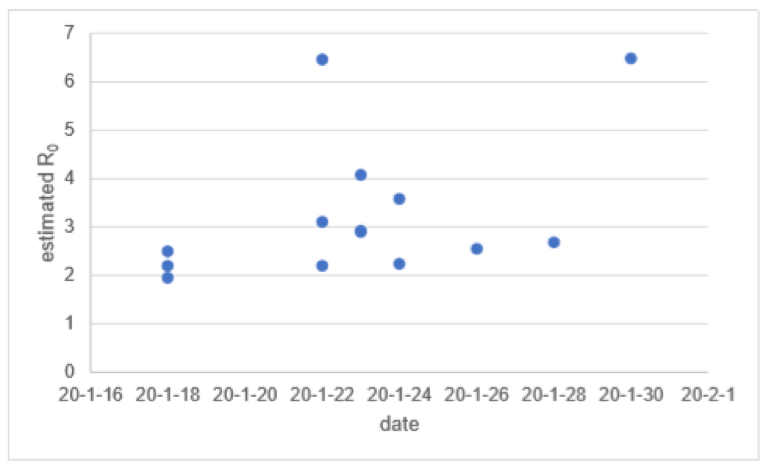
Figure 1. Timeline of the R0 estimates for the 2019-nCoV virus in China. Published in Lui et al. 2020.
Compare this to figure 2 created by New York Times writers Sheikh et al. 2020. The transmission rate data presented in figure 2 is the same as that concluded by Liu et al 2020. However, the labels use clear language and arrows are used to explain the axes. By comparing it to public known diseases, the audience can learn from this graph without having to read the entire article. The audience perception of COVID-19 transmission rates are more likely to be accurate looking at Figure 2.
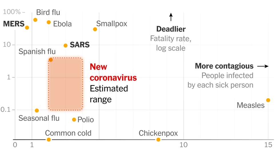
Figure 2. Data on fatality rates and number of transmissions per sick person from the World Health Organization, U.S. Centers for Disease Control and Prevention, Johns Hopkins University, Global Health Data Exchange.
What exactly is it about figure 2 that makes it easier to understand and how do you better communicate your data?
In MEES data visualization class this week, we learned how to optimize our scientific figures, so they are aesthetically pleasing and communicate the intended message. Small changes can enhance the readability and message of the graph. As stated by the class instructor Dr. Bill Dennison, “Little tweaks collectively make a big difference”. Below are three students before and after scientific figures following the tips and tricks learned in the previous class (Figures 3, 4, and 5). These basic design rules can pertain to all graphs, whether made for publications, posters, or presentations. Don’t forget that graphs are always a work-in-progress and can be improved upon.
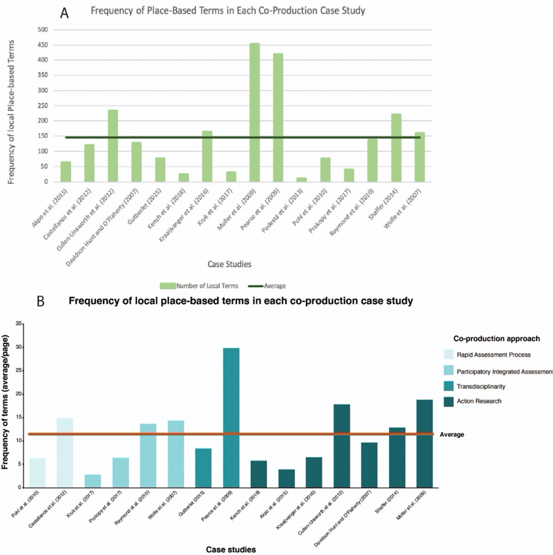
Figure 3. Alana Todd-Rodriguez before (A) and after (B) scientific figure showing the frequency of local place-based terms in co-production case studies.
Graphic design rules
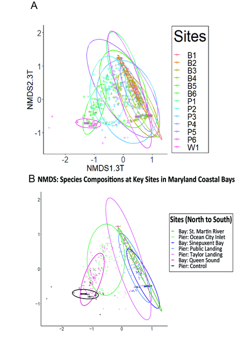
Figure 5. Madeline Farmer before (A) and after (B) scientific figure on species composition at key sites in Maryland coastal bays.
Rule #1 Keep the message and audience in mind. Only include data that helps communicate the message, while staying objective and without misleading the audience. Consider the best graph to show the pattern of the data and consider your audience when using acronyms. For example, Madeline Farmer removed the unnecessary data in her edited figure and removed the axis names with jargon (figure 4). When keeping the message in mind, grouping data with colors or symbols can add more information to graphs and change the overall message, as shown in Alana Todd-Rodriguez’s scientific figure (figure 3). She grouped the data by co-production approach to give more necessary information to the audience.
Rule #2 Remove “chartjunk”. Chartjunk refers to the unnecessary visual elements in the figure that do not improve the message and/or causes misinterpretation (Rougier et al 2014). De-cluttering graphs helps the audience to focus on the important aspects. For example, Todd-Rodriguez removed the horizontal lines and replaced them with tick marks on the y-axis. Keep in mind that visual elements that would be considered chartjunk in one figure, may be necessary in another.
Rule #3 Small changes matter. There are small changes that can be made to a figure that enhance the readability. This includes making sure there are no misspellings, aligning data and titles, and only capitalizing proper names (as seen in figure 3 before and after title).
Rule #4 Pay extra attention to the legend. When creating a more readable figure, consider the placement of the legend (whether it is better inside or outside the graph), whether the box around the legend is “chartjunk”, and categorize long legend information. Most importantly consider the names in the legend and make sure they are understandable to the audience. Madeline Farmer changed the legend to be in a clear order and fully wrote out the locations of the samples so they could be understood by the audience before reading the figure description.
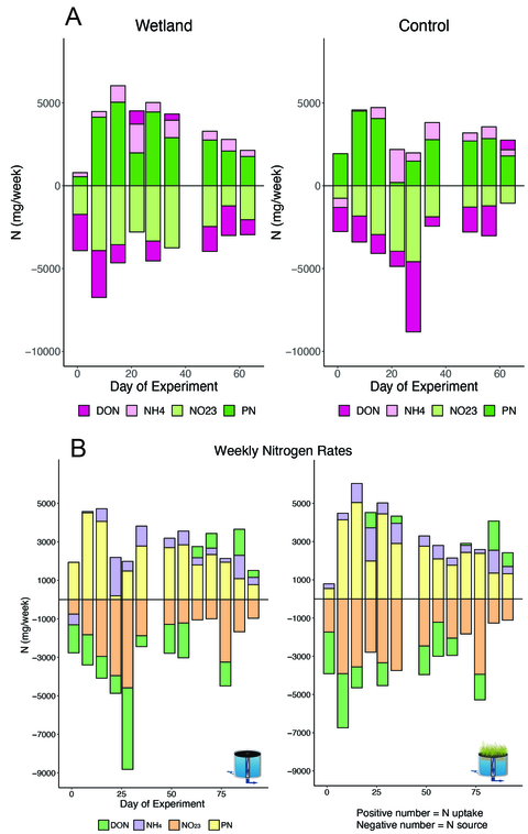
Figure 6. Isabel Sanchez before (A) and after (B) scientific figure on weekly nitrogen rates in a mesocosm with and without a floating wetland.
Rule #5 Graph + symbols/map/diagram = story. Combining a conceptual diagram with a graph can tell a story. If it's relevant with the graph data, a map or symbols can help orient the audience and increase the readability of the graph. Isabel Sanchez added pictures of a mesocosm with and without a floating wetland (figure 5). This quickly tells the reader the difference between the left and right graph.
Rule #6 Use colors wisely. Give the colors meaning and be sure to not use colors that are too bright or off putting to the audience. 1 in 12 people are red/green colorblind. Be mindful of this when choosing colors and always use both colors and symbols when possible. Sanchez switched her colors from bright colors with two greens that blended together to pastels that are easier to see trends in changing nitrogen species (figure 5).
Following these rules will help better communicate data to the audience and reduce the amount of misperceived information.
References
Liu, Ying, et al. "The reproductive number of COVID-19 is higher compared to SARS coronavirus." Journal of travel medicine (2020).
Sheikh, Knvul, et al. “How Bad Will the Coronavirus Outbreak Get? Here Are 6 Key Factors.” New York Times, 28 Feb. 2020, www.nytimes.com/interactive/2020/world/asia/china-coronavirus-contain.html.
Rougier NP, Droettboom M, Bourne PE (2014) Ten Simple Rules for Better Figures. PLOS Computational Biology 10(9): e1003833. https://doi.org/10.1371/journal.pcbi.1003833
About the author
This blog was produced by students in the Science Visualization course, offered by the Integration and Application Network through the Marine, Estuarine, Environmental Sciences (MEES) Graduate Program at the University System of Maryland. Bill Dennison and a team of IAN Science Communicators are teaching the course as a 'flipped' classroom so that class time is spent on hands-on training and discussions and feedback on student projects.
Contact Taylor
- Log in to post comments
Comments
Class Review
Taylor, I appreciate the timely topic you used to explain the importance of conceptual diagrams. I enjoyed reading the blog and I think you picked out great recommendations. I think the only thing that is missing is more links to resources. Specifically resources that back up the recommendations! In class we shared resources for color-palettes as well as some very interesting video links that discuss effective science communication. I think sharing informationisbeautiful.net and sciviscolor.org would really benefit this blog.
"Don’t forget that graphs are always a work-in-progress!"
Great job, Taylor. I think it is important to realize that making figures is always a work in progress and getting feedback from your peers and people outside of science will always help make your data clearer and more asthetically pleasing.
I will definitely go back to this blog post to refresh myself on the rules for making a good figure!
great blog!
I think this blog was very nicely written. I really like the numbered rules. I also really appreciate how you formatted the images to be in line with the text- I think this is much easier to refer back and forth from text and figures.